A few weeks into my role at LOFINO, I was informed of plans for an official rebranding — a significant milestone for the company and a major responsibility for me personally. This rebranding marked the first substantial update for the app in a long time, as nearly everything needed to be overhauled. The redesign wasn’t just about swapping colors; it required selecting a new palette aligned with WCAG 2 accessibility guidelines while staying true to the new brand identity.
This process also gave me an opportunity to address visual inconsistencies in the old color system, which had become cluttered over time due to ad-hoc additions during feature development. To simplify and streamline, I created a structured color palette: one primary color with four shades, a highlight color with four shades, two base colors (black and white), signal colors with additional shades, and a range of neutrals. Despite its clarity, the task was demanding, as it all had to be completed within three weeks.

The picture shows the newly created color system in Figma
Another pivotal aspect of the redesign was laying the groundwork for LOFINO's first-ever design system. While not directly tied to the rebranding, I seized the opportunity to kickstart the project, aiming to create a Figma-based system with accurate and streamlined components to serve as a single source of truth for both designers and developers. The goal was to make workflows smarter and more efficient by providing a cohesive set of tools.
This initial effort eventually evolved into the LOFINO Component System — an enhanced version of the design system. It incorporated advanced features like variants, variables, and properties, allowing for greater flexibility and detail in components. Beyond colors, I expanded the system to include spacing, corner radius, gaps, padding, and a revamped typography system.

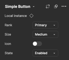
The pictures show the spacing system (left) and the setting options of a button (right) in the latest component system
Looking back, there are many aspects I would approach differently today — a reflection of how much I’ve grown as a designer. However, this project was an incredible experience, creating numerous opportunities for growth and innovation in a remarkably short time.
Here are my key learnings, which I was able to gather especially during this phase of my work: